


Today we’d like to introduce you to Gary Houston.
Hi Gary, we’d love for you to start by introducing yourself.
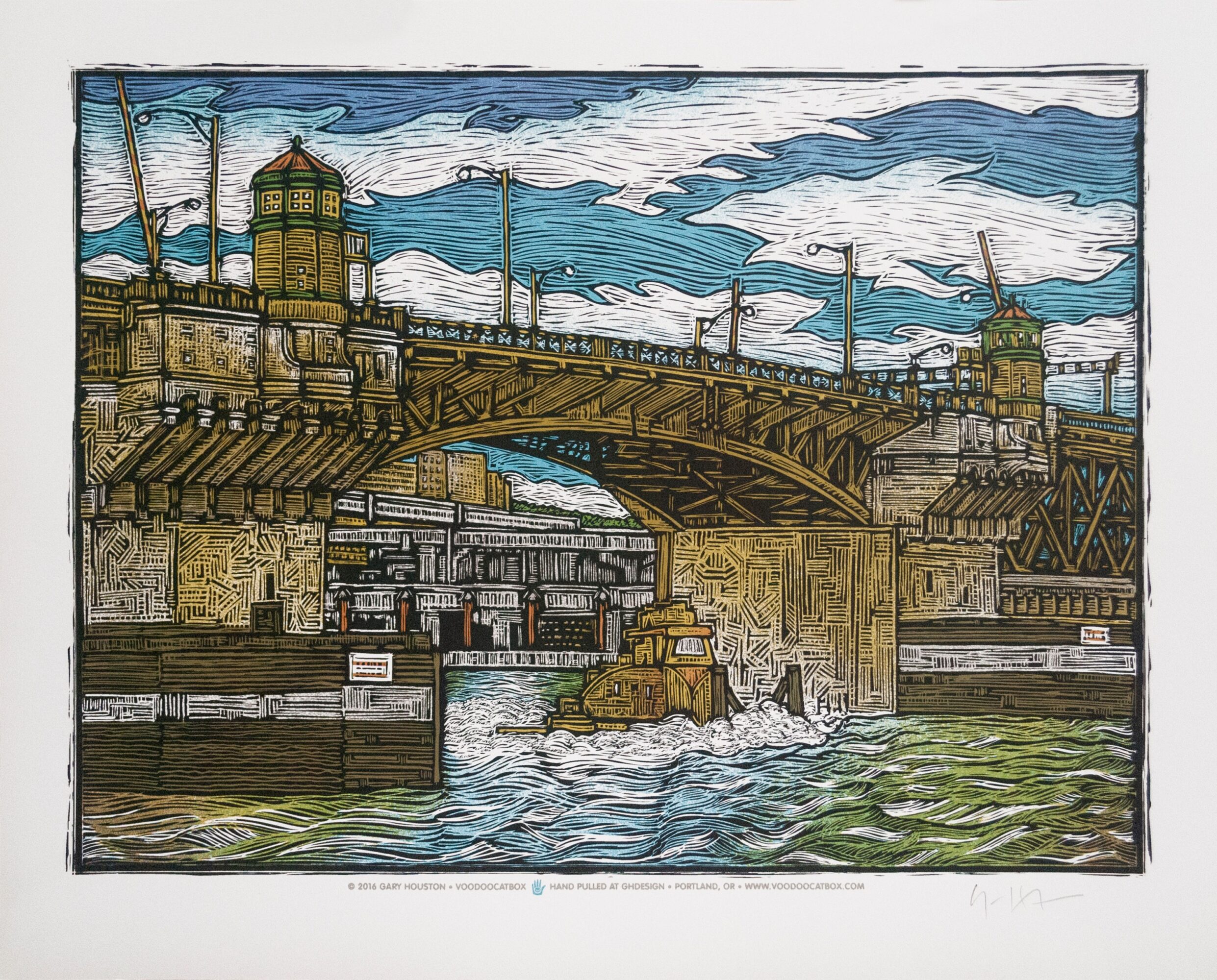
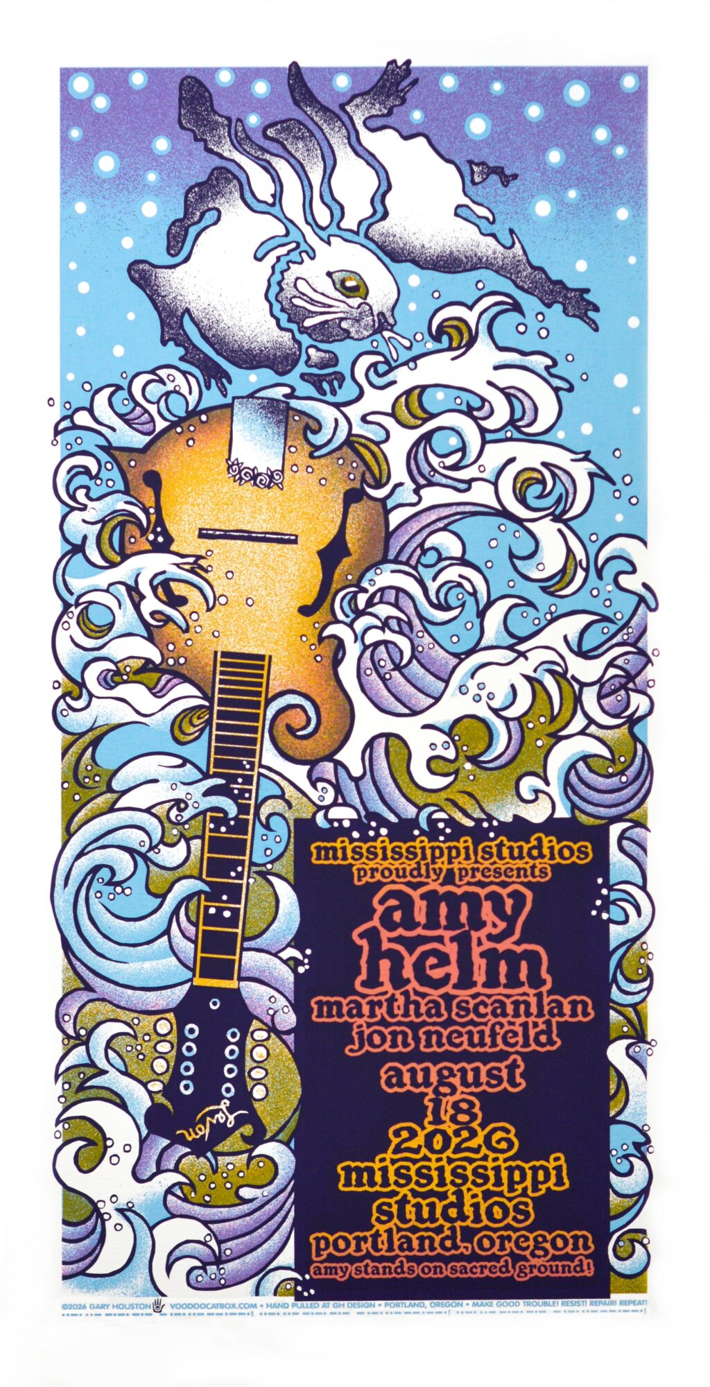
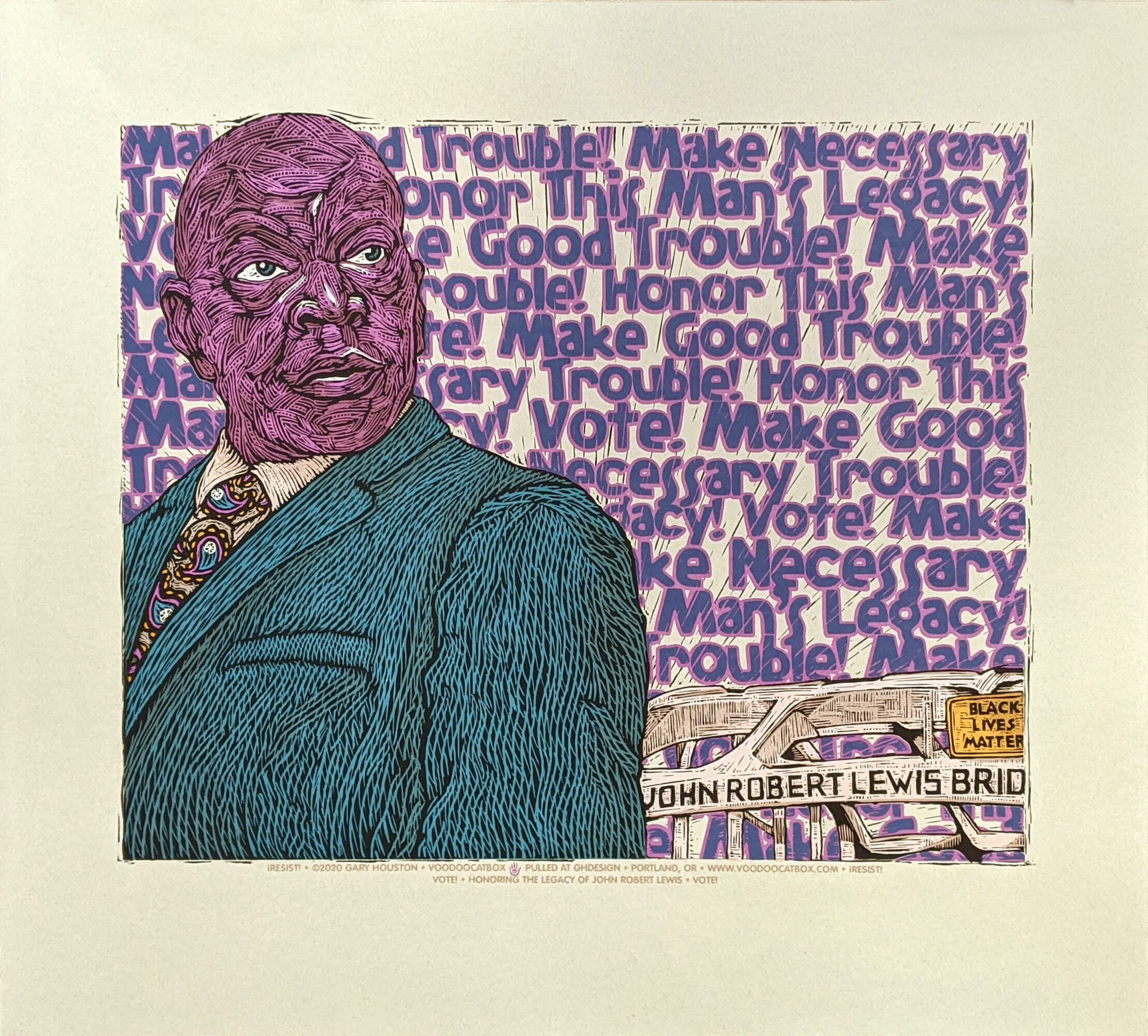
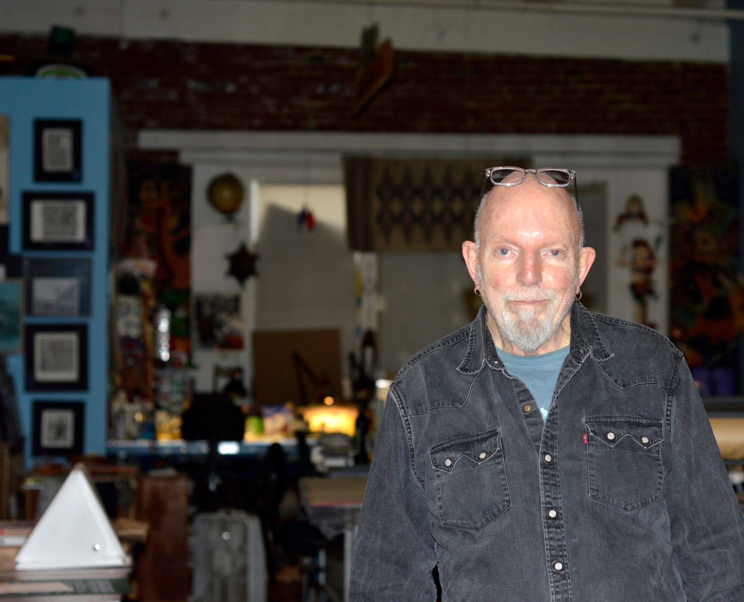
Howdy, my name is Gary Houston and I’m a graphic designer, illustrator and screen printer. I’m also a music junkie, so luckily, that combination adds up to making concert posters and prints. I make these under the moniker of Voodoo Catbox.
I was fortunate to grow up in a time when the ebb and flow of posters saw a rebirth in San Francisco. At the time, I was in junior high living in Wichita, Kansas—far from the exotic stomping grounds of change like San Francisco. This was also a very unique time in history as youth culture was exploding! Art, music, fashion and visuals! A sense that things were changing and were very different from the world that mom and dad had told you about! By high school, a friend and I were working for a local concert promoter designing posters and handbills. I’ve always lived life with a “seat of the pants” philosophy. In college, the goal was never to get a degree, but to pursue education and use the facilities the school offered. It was during this period that I moved to Kansas City to work at a One-Stop, a music wholesaler providing records and tapes to independent music retailers or record stores. I met my now ex-wife who lived in Portland and eventually moved here. In Portland, two friends and I established a design studio where we also screen printed. I got back into posters when I met Mike King and we had a very loose collaboration creating limited edition posters for music events. Although Mike and I went our separate ways years ago, I’m still doing this.
At this point I’d like to speak to how I approach making posters and the different processes involved. This is very self-contained, DIY! Hands-on! Organic! I very much like the ability to go from a thought or concept to holding a tangible finished poster or print from an edition all done within the realms of the studio! I find this to pretty much be magic! And what a great way to stumble through life!
There are three different approaches I take in creating images for posters or other design projects. Each starts with pencil sketches, then depending on the look I want, time allowance and the best way to get from point A to point B, I choose the approach. All of these are old-school, hands-on!
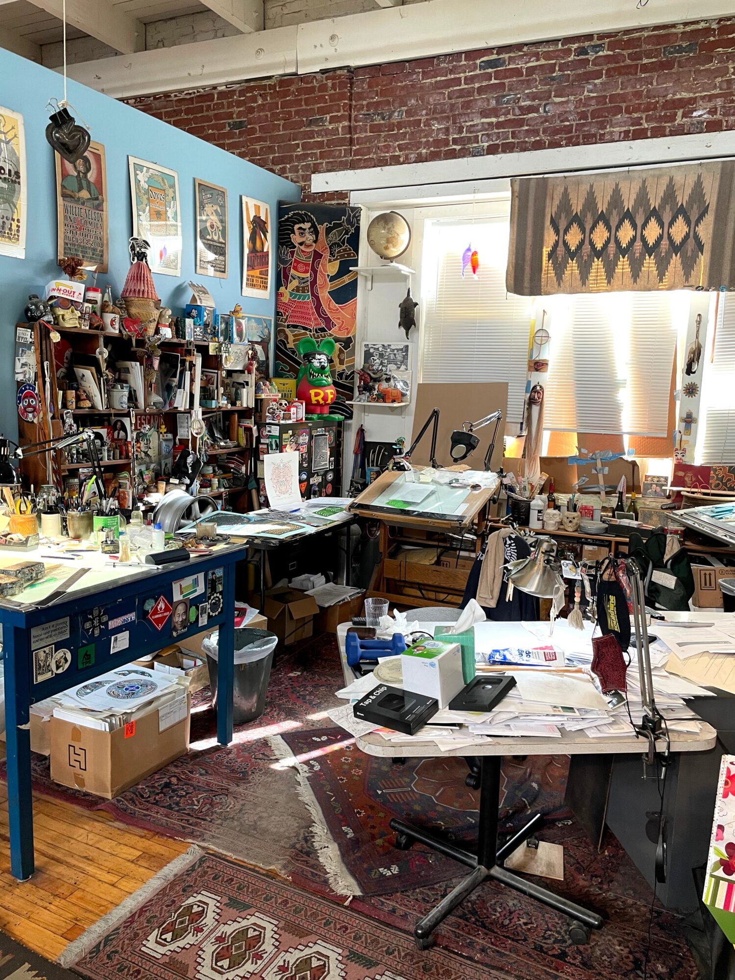
1. Sometimes I draw then ink the image to be produced. This might include hand-lettering the copy or titles. My inkings are done on herculene, a frosted plastic substrate that architects used to use for the drawing and plans.
2. Scratchboard is a process that I truly love! Its totally ass backwards to most ways of creating an image. The surface of the board is black ink on top of a white clay coat surface. The image is scratched away to reveal white beneath. I’m taking away rather than adding and also working smaller so that when the image is enlarged to size when going to film, it takes on a woodcut or linoleum cut look. With both of these approaches, the ink image or the scratchboard is scanned into the computer and enlarged to size so a film positive can be produced. At this point, we can also add copy to the image.
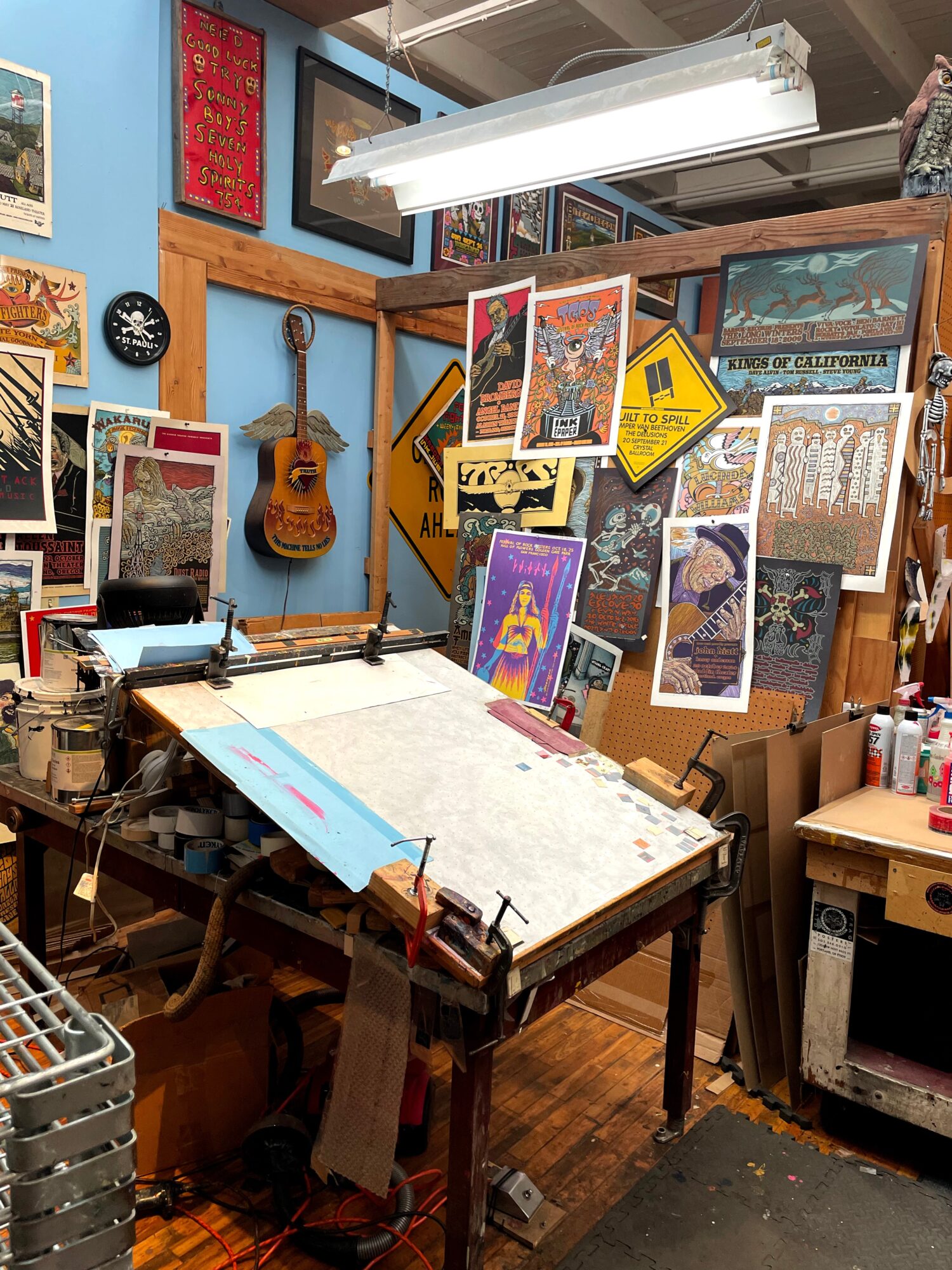
3. With this approach, I do a drawing at a small scale that is then scanned into the computer. The image is enlarged to size and then printed out on paper. This paper is then taped down on the light table and is used as a road map to hand-cut or redraw the image with an X-acto knife. Here, I’m cutting the image out of rubylith, a film that is a see-through red on a clear carrier. When cut, it can be peeled up, taking what you want to remove and leaving what you wish…totally old-school!
This is also how I create the line art for approach #3. It is also how the color separations are done for all three approaches. You may ask why not create your seps in the computer and output them from the printer? If we did so, we would be going through film like crazy and we would also be going through ink cartridges for the printer. I would also be locked in to not having the ability to make changes. When I’m making my color seps, I’m always making changes! I also enjoy working on the light table. Its something akin to a zen exercise. Here, I can employ tricks such as peeling up areas of rubylith and then using an airbrush to create areas of graduated tones. When making the color separations, I’m creating information that I can expose onto a screen and then print over and over. The color separations can be whatever colors or combinations you wish to do. I usually do like a poor man’s four color process. I add transparent base to my inks so I can overlap colors to achieve more colors. Ocher alone is ocher, with magenta it is red, with blue it is green. Magenta alone is magenta, with blue it is purple. All three make brown. Think of this all as making a puzzle, taking it apart and then putting it back together hoping that everything fits together. I believe that everything should be educational and that we should share our thoughts and techniques with others.
Can you talk to us a bit about the challenges and lessons you’ve learned along the way. Looking back would you say it’s been easy or smooth in retrospect?
No, there is no such thing. And if things are too easy, then they’re probably of little or no value. With the rough road, we’re supposed to learn and hopefully retain how to do things.
Can you tell our readers more about what you do and what you think sets you apart from others?
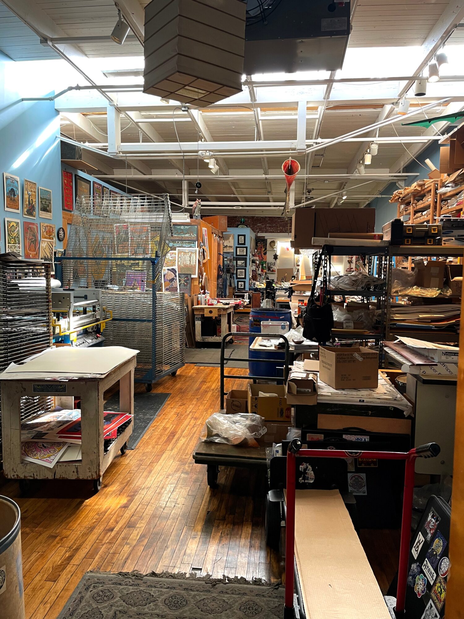
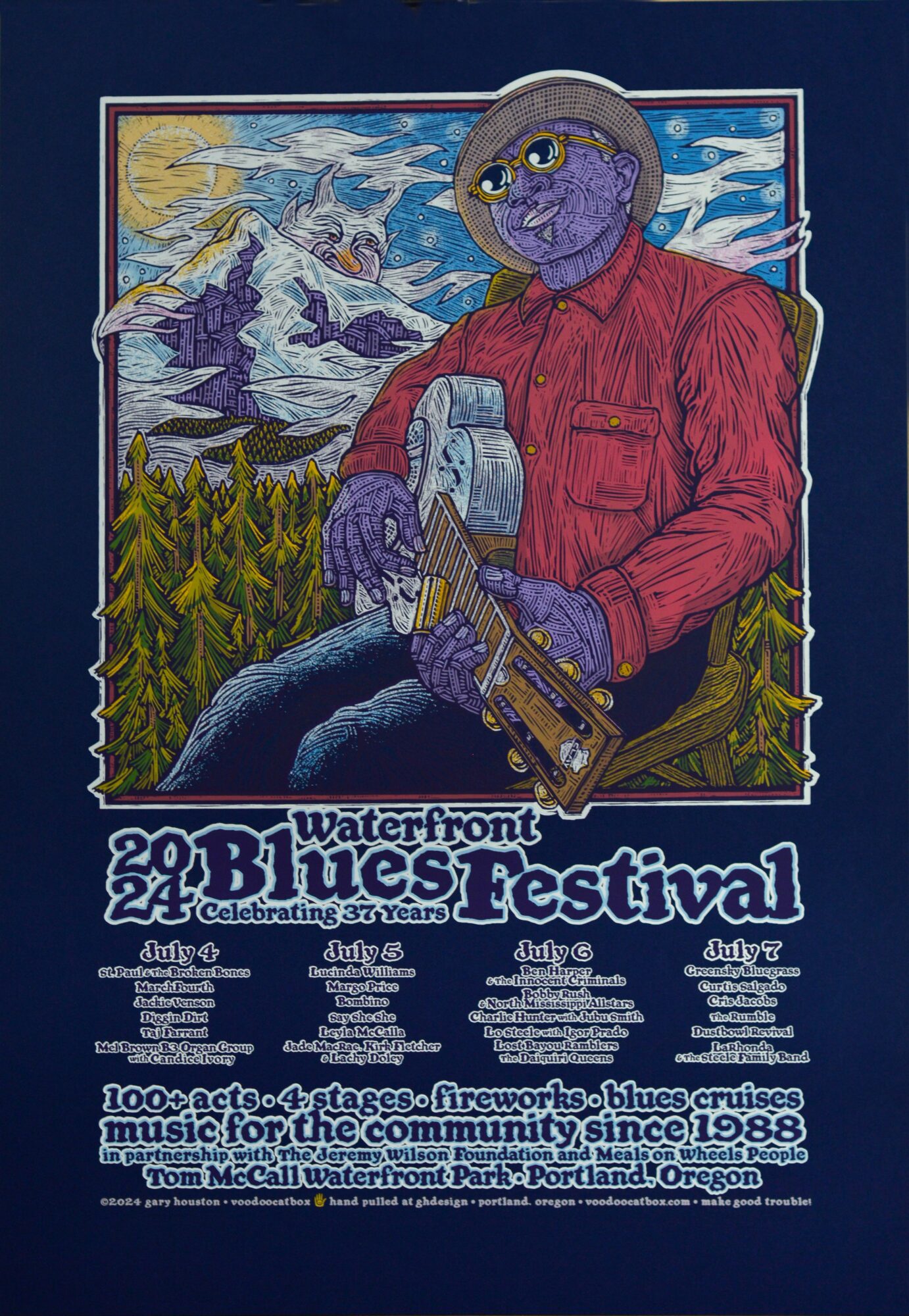
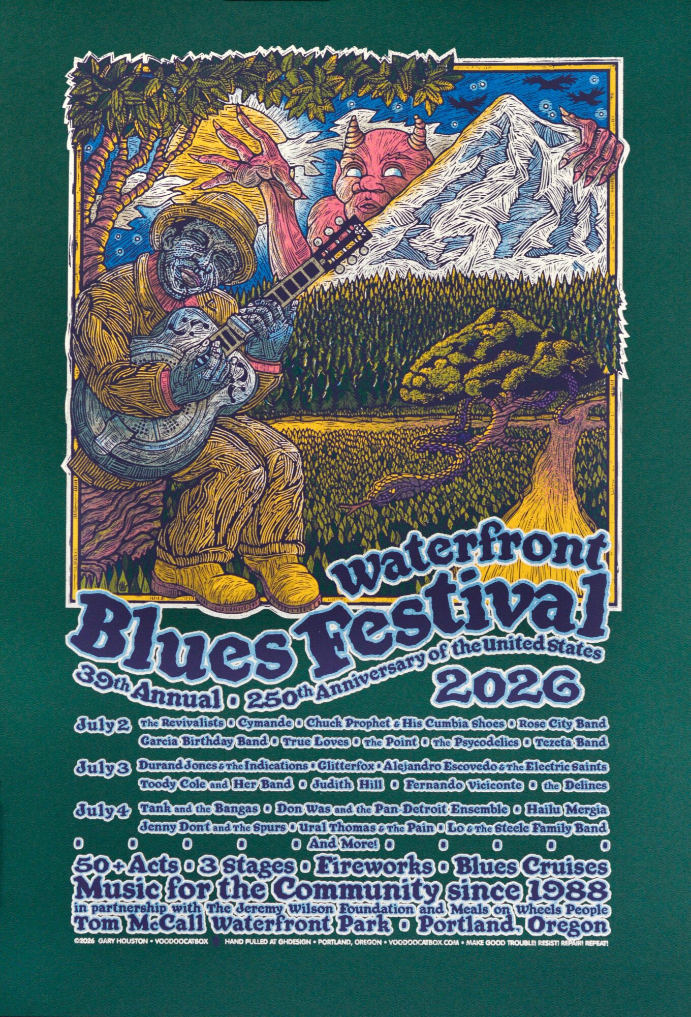
My business name is Gary Houston Design and Illustration/Voodoo Catbox. I have a studio that’s open to the public located in the St. John’s neighborhood. The building address is 6635 N. Baltimore Ave. Portland, OR 97203. We have an open door policy, folks are welcome to visit but its nice to have a heads up or make arrangements ahead of time because of our work schedule. Emails are a great way to do that. I’m mostly known for creating limited edition concert/tour posters and prints. This year, barring a year of covid, I celebrated 25 years of doing poster and t-shirt art for the Waterfront Blues Festival in Portland, Oregon. I pretty much do everything by hand. I do have computer assistance from Sonia Garcia who does my digital work.
What do you like best about our city? What do you like least?
When I moved here, Portland was a small city. Its larger now, but still retains a very creative rhythm or pulse to it. And there is so much talent in this city! I’m very fortunate to have talented friends!
Our homeless population is still a large focal point. We talk about it, but little is done. Folks need to be treated with dignity and addressing the problems of those on the street would go a long way to support that dignity.
Contact Info:
- Website: https://voodoocatbox.com
- Instagram: @voodoocatbox
- Facebook: https://www.facebook.com/VoodooCatbox