


Today we’d like to introduce you to Tim Oakley.
Hi Tim, can you start by introducing yourself? We’d love to learn more about how you got to where you are today?
• Hawaii born (1957) & raised.
• Graduated from NYU (1977) & SRJC (1983) Applied Graphics & Film Background
• Worked in Santa Rosa, CA from 1982 -1986 (senior art director), Marin County 1986-1989 (senior designer).
• Worked back home in Hawaii from 1989-1992 (senior art director)
• Opened Oakley Design in 1992, Portland Oregon – still operational to this day.
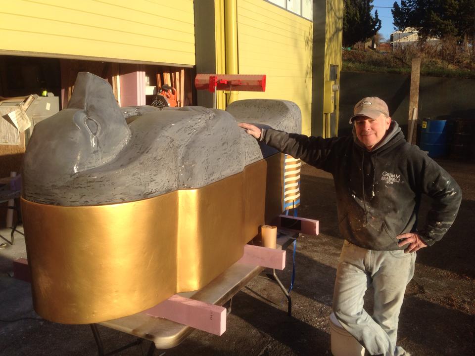
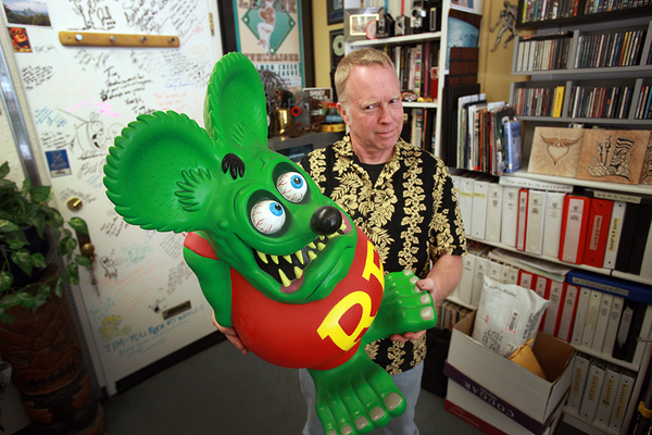
• Worked primarily during this time in general client high-profile graphics, moving towards the TV/Film/Music industry around 1998. Worked on over 120 film projects – including all 3 Dark Knight projects, Mystery Men, Jurassic World, Star Trek, Spiderman Brand new Day, the first 3 seasons of GRIMM as their senior prop fabricator & designer, all 4 seasons of The Librarians, countless more. IMdB: Timothy Oakley
• Honored in numerous design & logo books.
Would you say it’s been a smooth road, and if not what are some of the biggest challenges you’ve faced along the way?
Yes and No.
Back in the late 70’s, only established artists were working steadily. You had to fight just to get an interview. I fought to get an appointment with legendary artists Milton Glaser & Andy Warhol just to have them cirque my book. Not only did they like what they saw and gave me encouragement, but also led me to my first 2 real clients. When I left NY, my confidence level was stronger than when I arrived.
Can you tell our readers more about what you do and what you think sets you apart from others?
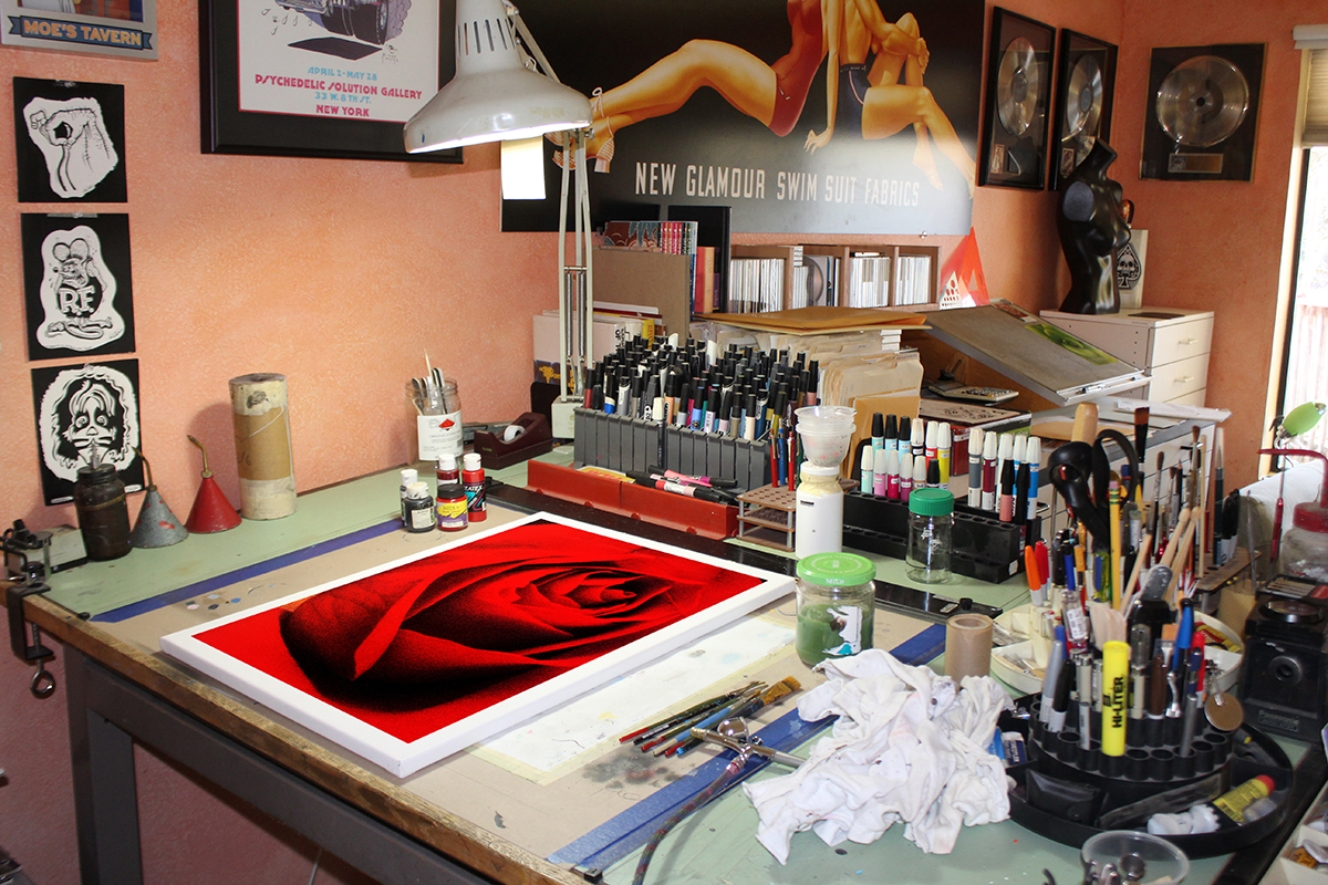
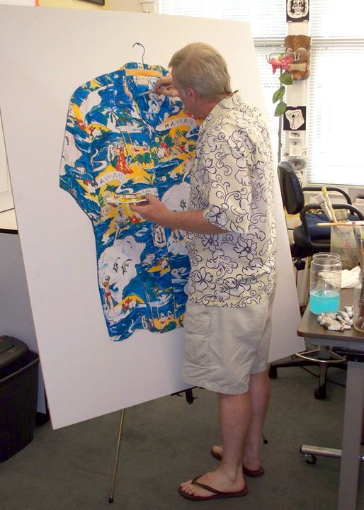
In the beginning, my earlier work was somewhat loud. I was young, and was trying out ideas that I saw no one else was attempting. As I polished those ideas, I also learn a cleaner ways to articulate my eye-to-hand line art inking. Soon after, I was known for my detailed line art. I was hired by wineries, automotive companies, computer simulators, etc. After around 3 years, I was beginning to see that I was either being copied or there was an over saturation of line art illustrators. Don’t get me wrong, I still on occasion will accept a line art project. However, due to the over saturation, I revered back to airbrush illustrations. I, along with other illustrators like Cacy, Kimball, Mattos, we all started doing airbrush work for film, television, recording & packaging companies. If you could airbrush, you were working steadily. This went on for about 7-11 years, before computers took over. With that said – original line art & airbrushing are making a huge comeback.
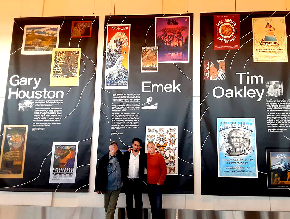
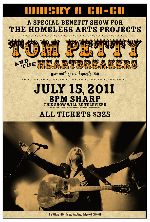
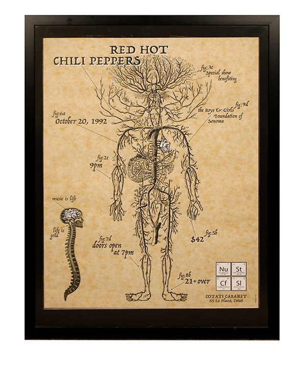
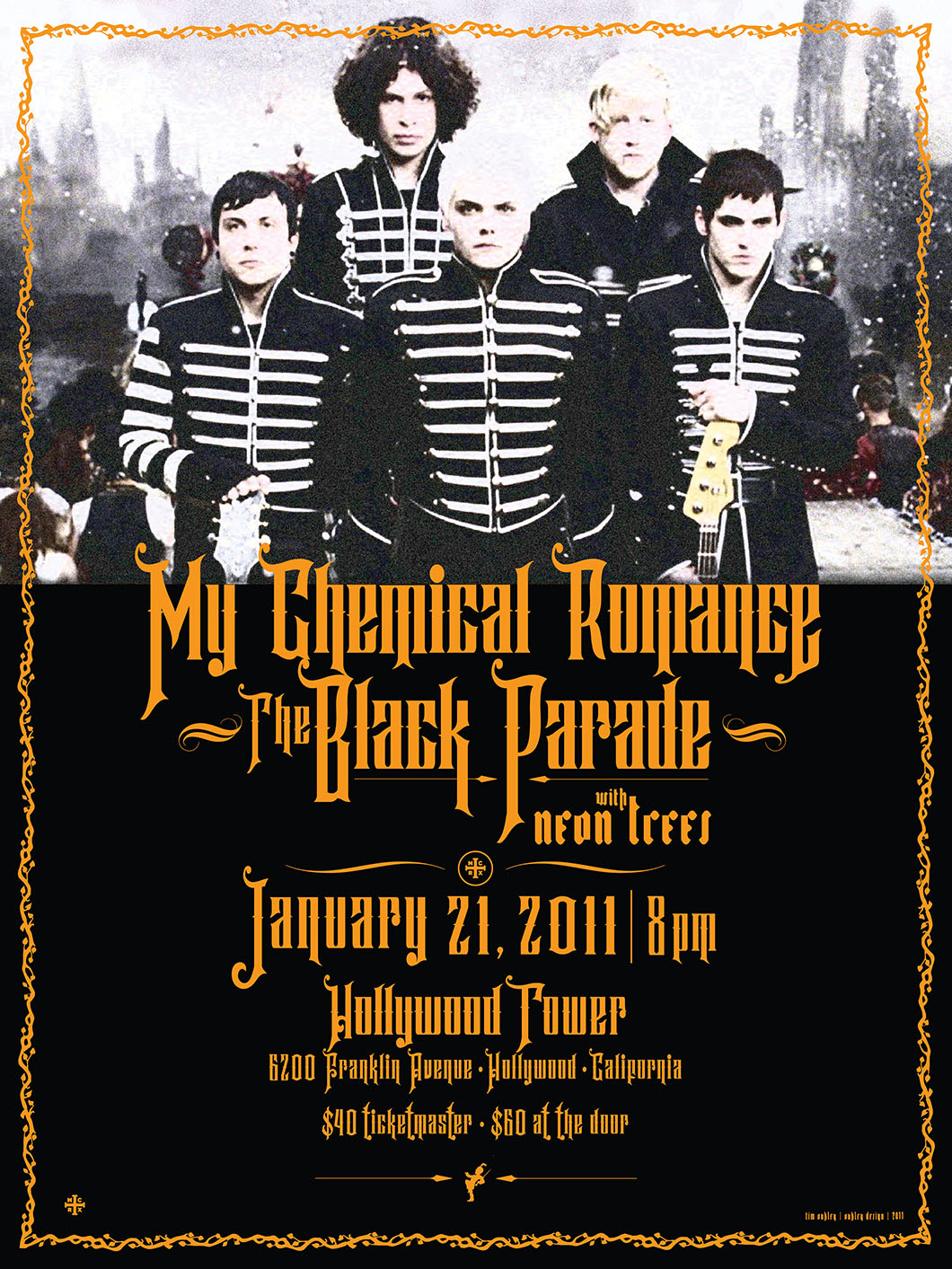
For years, I was also known for my creative typography. This came handy when I started working on rock & concert posters. What started as a creative hobby, became a business. Within 10 years I was creating posters for The Who, Todd Rundgren, The Tubes, The Romantics, Greg Kiln. Norton Buffalo, Robyn Hitchcock, U2’s earlier years, etc. This led to stage design for many of these same bands. Since then, I have design posters for Brittany Spears Las Vegas shows, U2’s LV shows, Lady Gaga, & Adele. I’ve been blessed to showcase my work along with great friends like EMEK. Gary Houston, Stainboy, & Butterhead.
What am I proud of? Thats a loaded question.
I guess my earlier work I am most fond of. Everything was rough, course, organic, off the hip, but most of all ugly & beautiful at the same time. It attracted people to look at the art and not necessarily the message. However, I am also proud of all my design creations or film & TV. I was once told by an Oscar winning director I was working with, that if they gave out Oscars for Prop Fabrication, I’d have an office full of them.
What set me apart from the others? I was told numerous times that I listen without interrupting. And let the work speak for itself.
What would you say have been one of the most important lessons you’ve learned?
Listen with you Eyes.
Speak with your Heart.
And learn to make mistakes.
Contact Info:
- Website: https://oakleydesignpdx.com
- Instagram: oakleydesignpdx
- Other: Imdb: Timothy Oakley